We started drawing with colored pencils. For this assignment, we had to draw three spheres and three cones using multiple Prismacolor pencils. Although I still struggled a bit, I had an easier time showing values and transitions between them than previous drawings. I that by using various different colors, I can show transitions between values easier.
0 Comments
Brainstorming Ideas All SketchesIn Progress PhotosFinal Drawing 1. I made the view by taking a picture near the back of the car so that the wheel took up a good portion of the photo, but angling the camera so that the back door of the car and a part of my house could still be seen.
2. It is important to learn and draw perspective because it allows for interesting and creative photos and drawings. A certain perspective can make a work of art more interesting to look at. 3. The perspective exercises helped show a center of interest for this drawing. It emphasized the wheel, but still allowed of parts of the car and a bit of my house to visible. The pencil exercises helped me out with shading and value. 4. I think the main technique I used was trying to get many different values to be visible in the picture. I think the values are defined fairly well, but I think I could've made certain parts of the wheel darker. 5. I think I was able to achieve a foreground, and a bit of a background, but not really a middle ground. The wheel takes up most of the foreground, while the house takes up the background. I think the door of the car could be considered the middle ground, but I don't think the picture is drawn clearly enough for the middle ground to be easily described. 6. I had trouble when drawing perspective. I think the main issue was that it took me a long time to draw and shade in the perspective drawings we have done so far. Using a ruler on them made them look better, but it still took me a while to complete them. However, I think perspective is good for defining foregrounds and backgrounds, as well as giving a picture a 3D appearance. I think the perspective is at least good enough to show that the wheel is in the foreground, while the house is in the background. 7. I think I was well prepared for this project for the most part. I think the values and reflections look just fine. However, I wish I was better at making smoother value transitions. Whenever I try to show a value transition, it does not look smooth. I used a No. 2 pencil for most of this project, and I only found out I was allowed to use the other pencils when I was already fairly close to completion. I think that using the other value pencils from start to finish could've helped to improve the values. The top three pictures are my work in progress photos, and the bottom picture is the reference photo. We were asked to upload three work in progress photos of our project. I think I am doing just fine on this project, but I still have a bit of difficulty making the proportions accurate.
We were asked to upload the final sketch of our perspective project. The picture on the left is the drawing, and the picture on the right is the reference photo. It took me a while to draw, but I think it's coming along well. I still had a bit of trouble with the proportions, so I tried drawing the picture to make look accurate to the photo, while keeping the sizes of the parts of the wheel relatively similar.
View inside of table drawerI put some stuff inside the drawer in my table and took these photos. I tried angling the camera to get somewhat different views. I didn't have too much trouble taking them. It might take a lot of time to draw, though. Worm's eye view of carI took pictures of my mom's car from a worm's eye view. I had a bit of trouble here. The car was parked outside, right in front of the garage door, so I didn't have much room to take pictures from the front. I also wanted to avoid making the pictures too similar.
 This is my list of ideas for perspective photos. We had to come up with fifteen ideas. I had a bit of trouble coming up with ideas, so I tried to stick with somewhat basic perspectives. We will use these to help us decide what we will use on the project.
We had to take photos with a forced perspective. This was pretty difficult for me to do. My brother and I had trouble coming up with ideas for pictures. I just had to use what I had because we couldn't come up with many creative or good ideas to use.
1. For the first picture, I asked my brother to take it. We tried to make it so that the water bottle and I were the same height. 2. For this photo, I placed the water bottle behind the frying pan. I positioned my phone in a way to make it look like the bottle was in the pan. 3. I held my shoe over the remote. I wanted it to look like the shoe was stepping on the remote. 4. I placed the stack of cup lids up close, and placed the cup further away. I tried to make it look like the stack and cup were the same height. 5. I placed a can of soda up close, and a stack of two cans further away. Instead of making them appear to be the same height, I positioned the camera so that the bottom can in the stack was not visible. I wanted it to look like there were only two cans total.
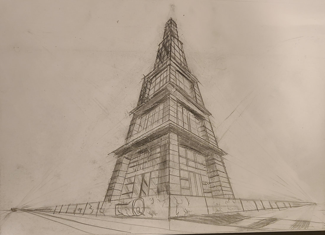
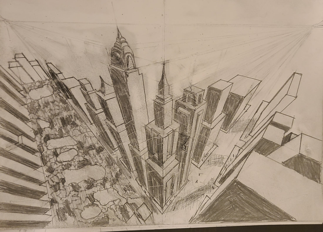
These are my three point perspective drawings. We had to follow along with the artist in both videos. They were very time-consuming to draw, but I think they look okay. I think the shading could've been neater. I had a bit of trouble drawing lines very close to each other, and then shading neatly around them.
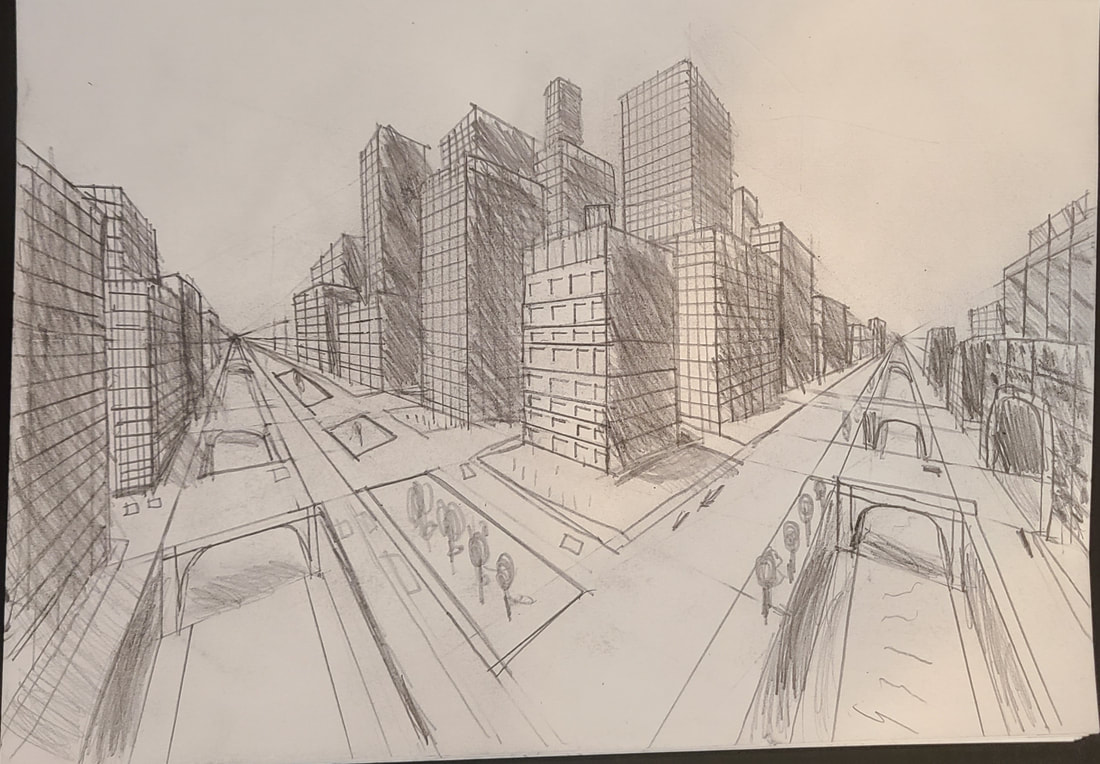
We drew two pictures, but this time it was in two point perspective. I found it very time-consuming to draw them, but we were given another day to work on them, so I spent time making the lines and shading look neater and darker on the picture on the right. I think this improved the drawing.
|
AuthorWrite something about yourself. No need to be fancy, just an overview. Archives
January 2021
Categories |


 RSS Feed
