|
Art Criticism Process: 1.Describe what you see in the work of art. Think of what images you see in and think about how you'd describe to someone else. 2. Analyze what you see. List design principals and elements. Think of color, shape, texture, variety, emphasis, spacing among many other things. 3.Interpret it. Think of what emotions it is supposed to show. Think of what represents and tells. 4.Judge the artwork. Is it good? What do you believe went well, or could've been done better? Be sure to support what you believe with evidence and/or criteria.
 Answer to question 12: Because the mixed media assignment required us to use multiple mediums, I believe it was the one I used skills/techniques learned earlier the most. It helped me get creative with the patterns and colors I used, trying to make it as colorful and appealing as I could. It has helped me get better with using multiple mediums such as watercolor,clay, and acrylic paint. I believe I was able to use those mediums better than my previous assignments. I think I was able to make this look neater and prettier than before.  Answer to question 13: During my time in this class, I had the most difficulty with getting the right colors. This could be either finding the right colors, or making/mixing the right colors. For the self-portrait, I couldn't make exactly the right colors for my skin or the background. For other assignments as well as this one, I had to change the colors a bit to make as close to the actual picture, but still keep it close to the original. I think it would be better to buy my own colors if I can, instead of using the colors available in class, because they are not always the ones I need. 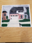 Answer to question 21: I believe that the acrylic painting assignment was my least successful. We had to take a picture of a place important to us, so I went with my house. It turned out a lot worse than I was hoping it too. I had a lot of trouble getting the right colors, and it isn't neat at all. I couldn't mix the colors right, and I couldn't show shading or differences in light. It isn't very accurate, or at least as pretty, as the actual picture I took of my house. If I were to redo this assignment, I would not only take a picture of some other place important to me, but I would put more effort into making the painting look cleaner and prettier. Overall, I can say that this class was pretty enjoyable. I always wanted to get better at drawing, but never had the motivation or patience to do so. This class helped me stay motivated to get better at drawing, and now I do enjoy drawing pictures for fun from time to time. I will miss this class.
-Pasha Palko
0 Comments
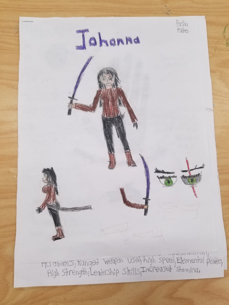
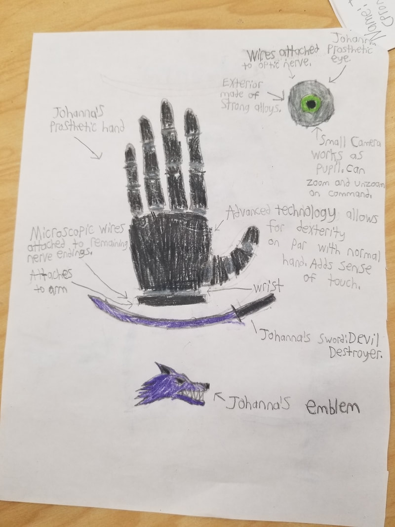
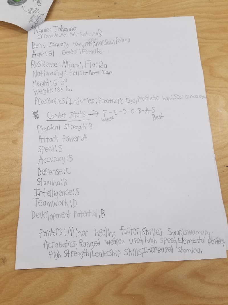
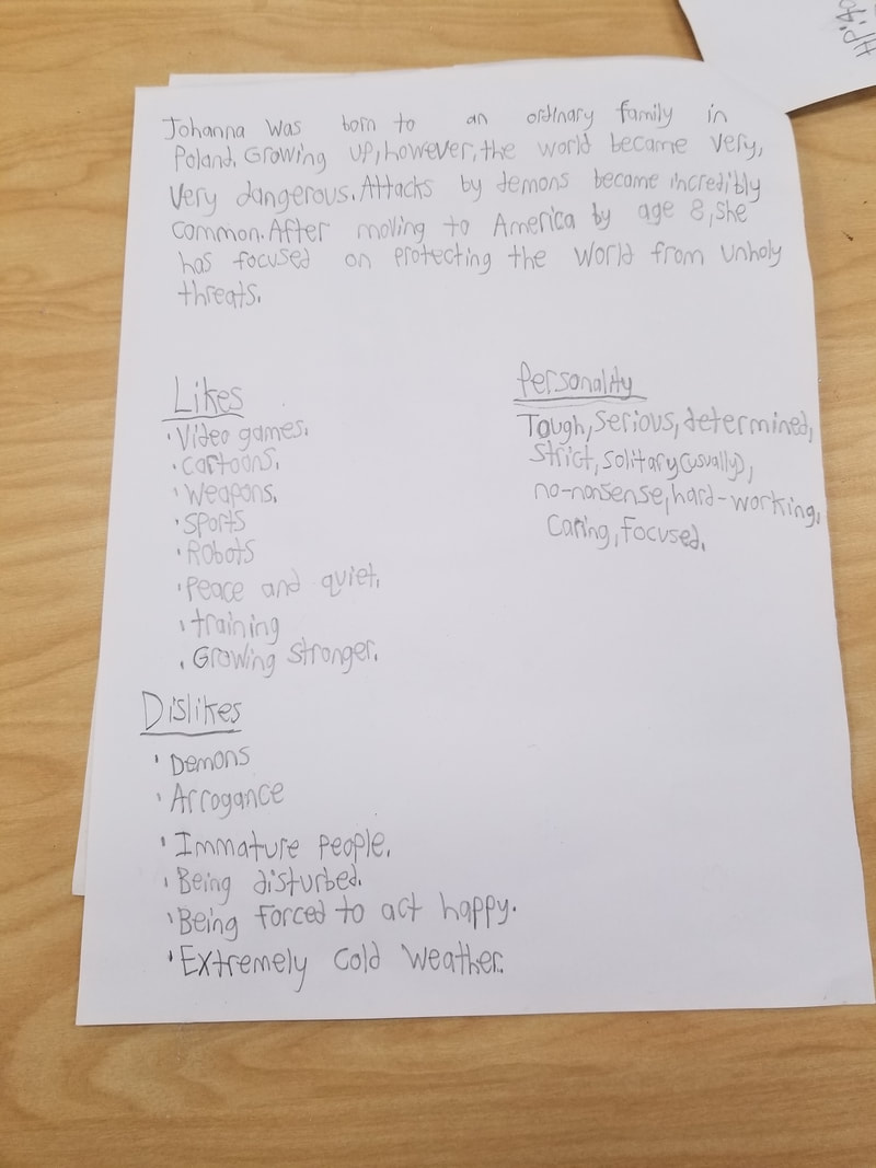
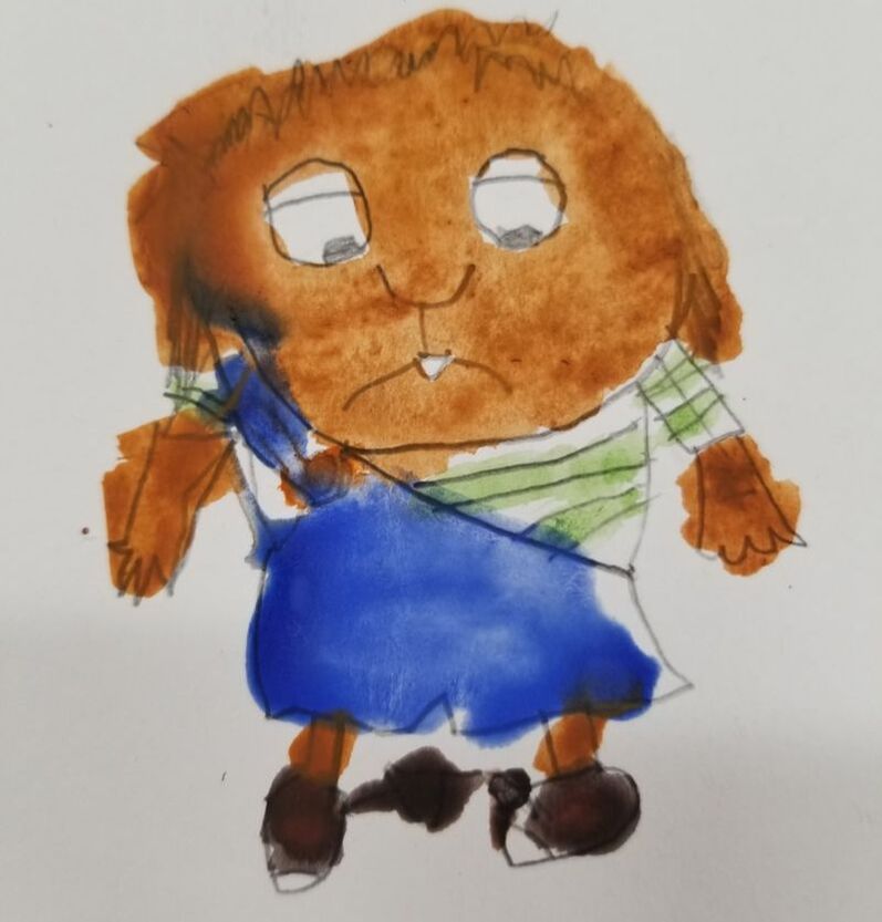
I created a character for our last assignment. I've named her "Johanna." I had an easy time coming up with information for the character herself. I had trouble getting the proportions right at first, they looked unusual when I tried to draw them. I probably should have went with a different art style, or a completely different character all together.
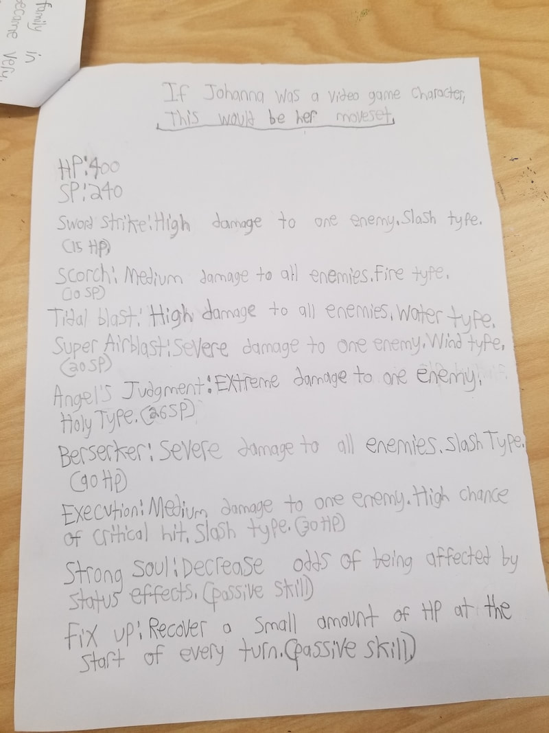
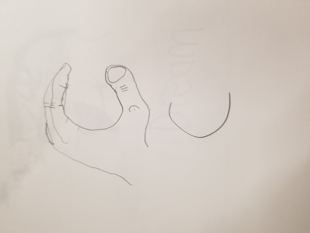
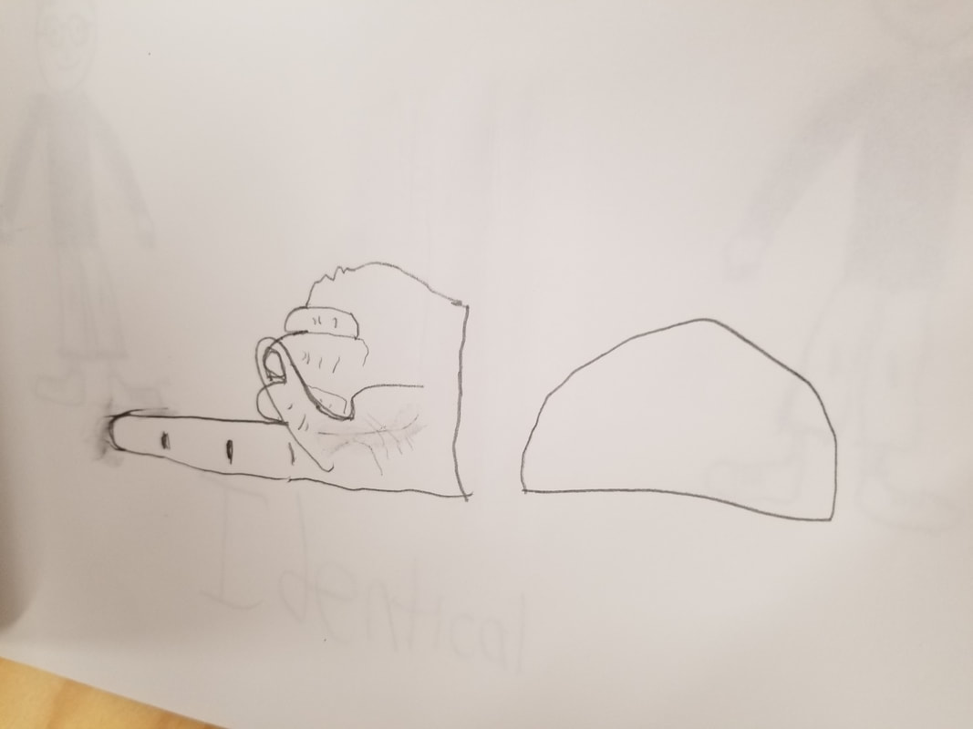
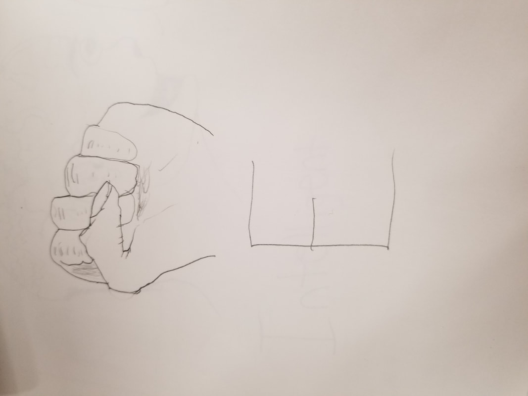
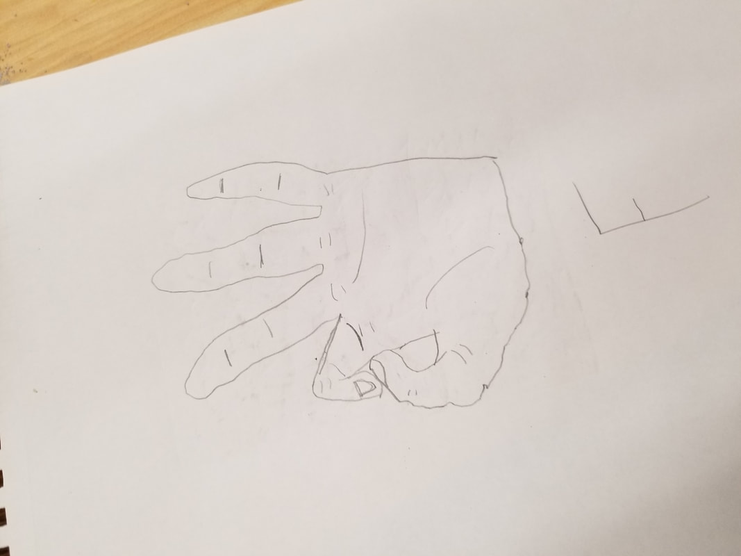
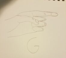
I started by drawing her out on the from of the packet. On the other side, I came up with designs for her prosthetic hand, prosthetic eye, weapon, and emblem. then I listed out basic information of her, such as age and date of birth. I listed out her stats and her abilities. I listed out the backstory/bio for her, and her personality and likes/dislikes. I finished it of with listing a set of skills she would have if she were a character in a turn-based video game.
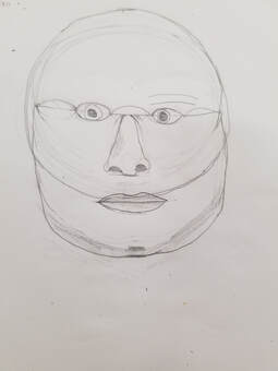
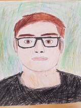
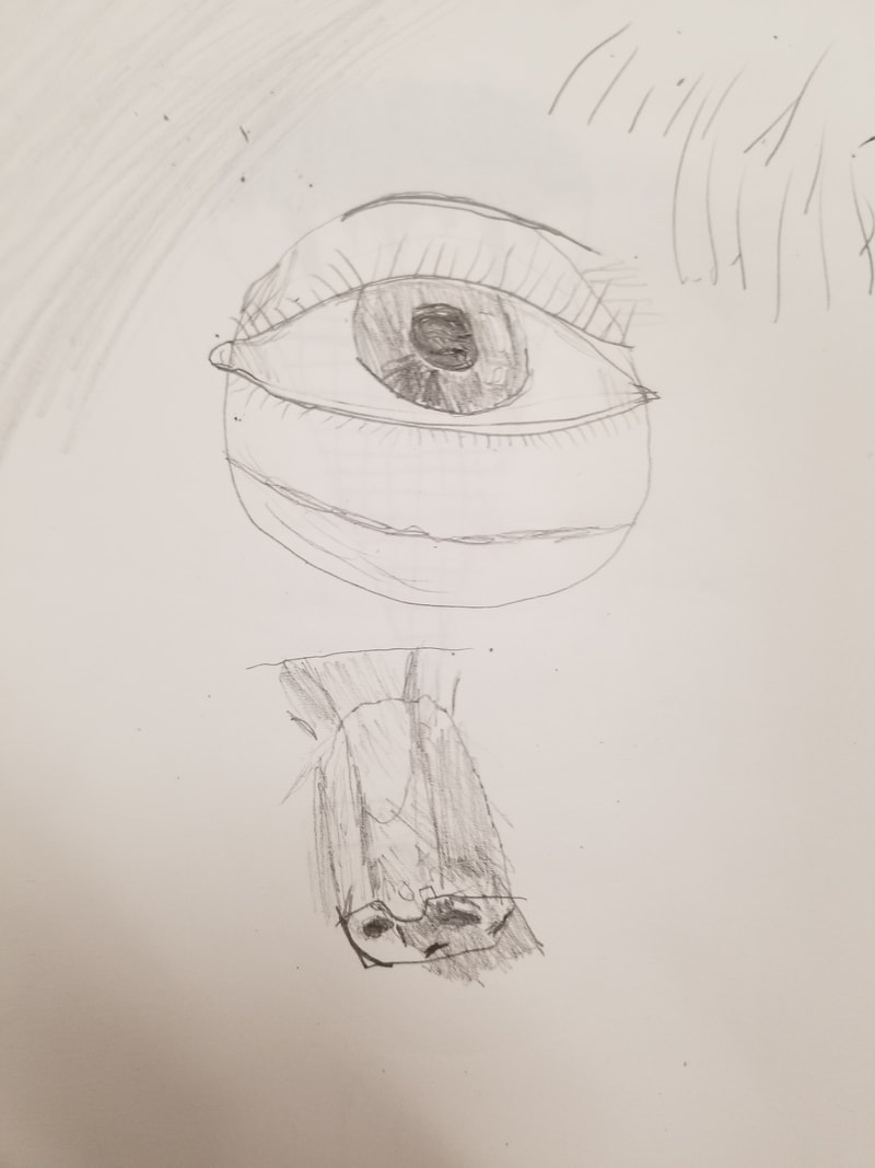
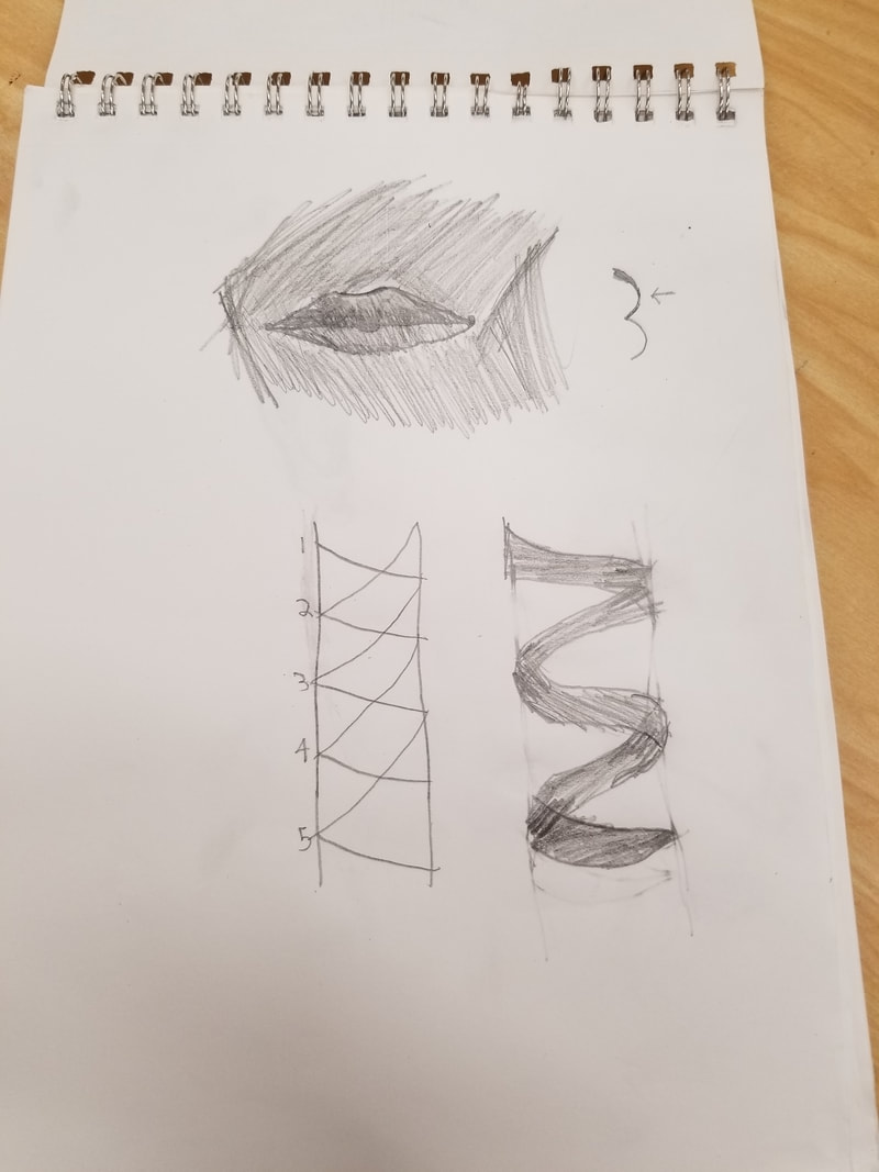
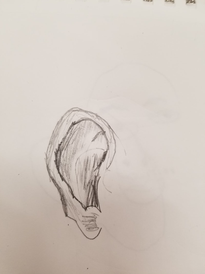
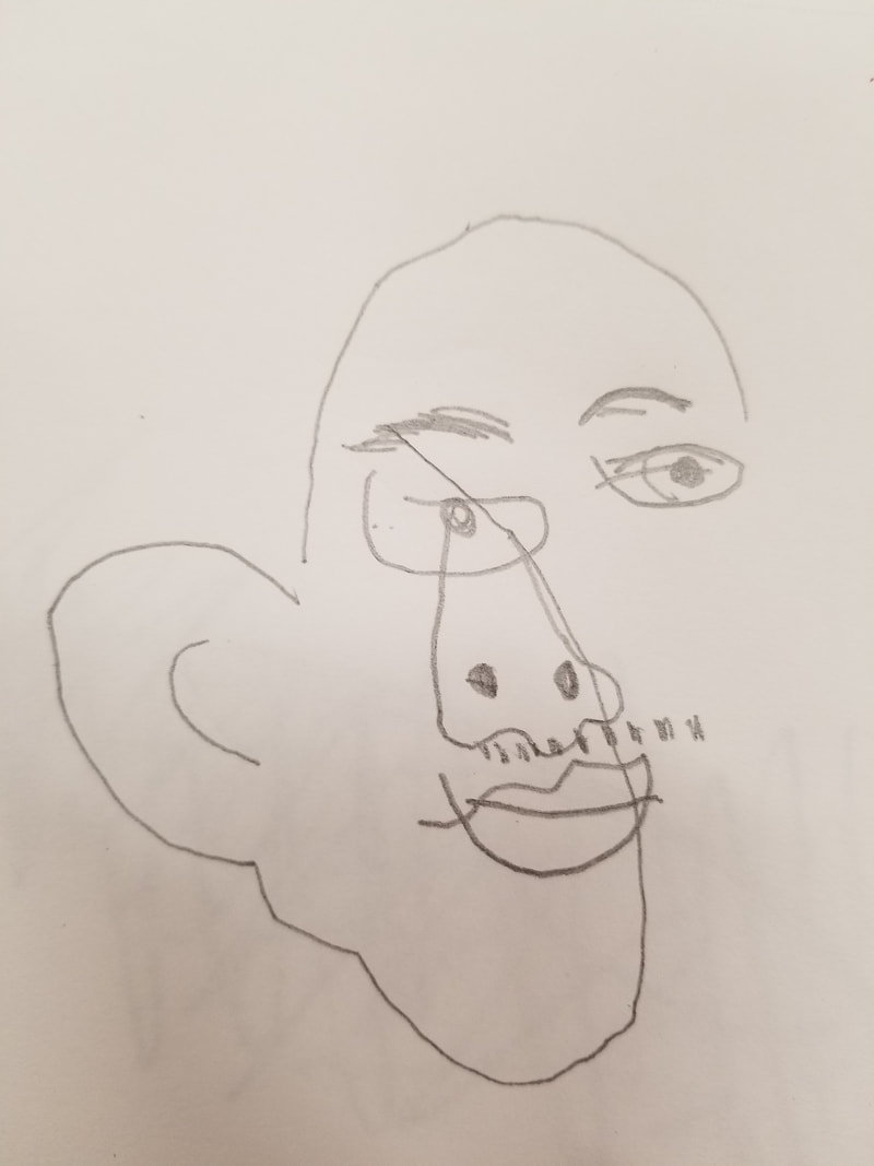
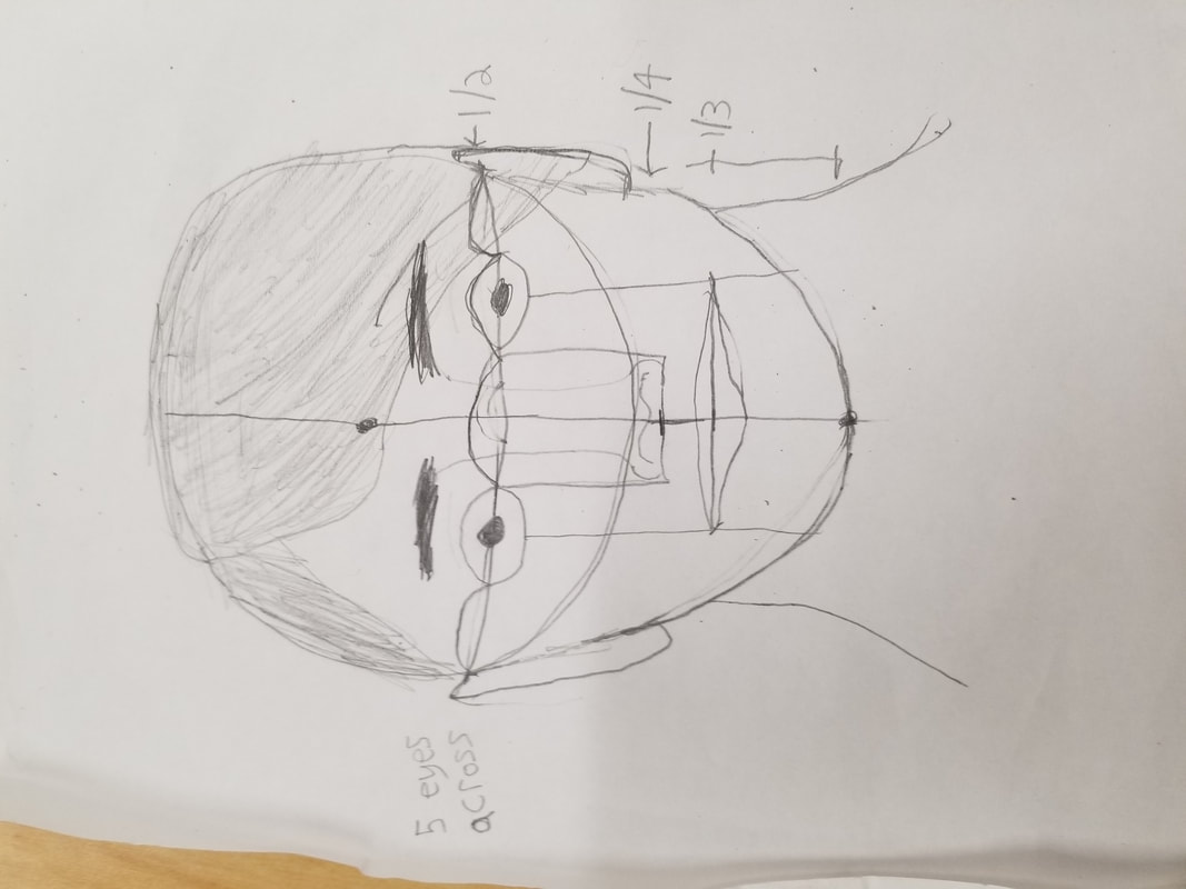
I drew a portrait of myself. The first picture is an incomplete version that I got rid of because I didn't like how it looked. The second picture is the completed portrait, I don't have a picture of the second one while I was working on it. I used pencil, colored pencils, and Prismacolor pencils. After starting over and beginning what would be the actual portrait, I started by drawing out the head shape and facial features. I drew the neck and shoulders afterward. I started by coloring the parts that would be easy to color, such as my hair and glasses. I had some trouble getting the correct color for my skin and background, as I did not have access to the precise colors needed. My wall, which is the background, is actually blue. The lighting in the photo used to make portrait made the wall look like a dull green. If I were to redo this, I'd use a different background.
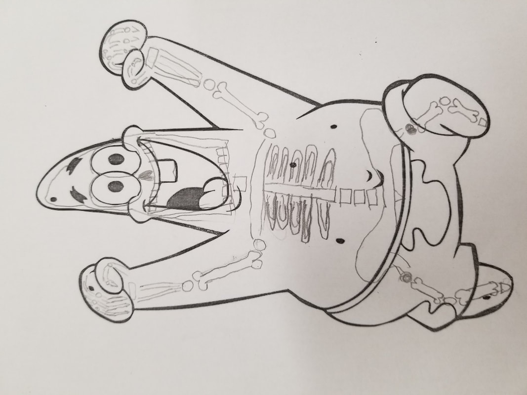
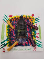
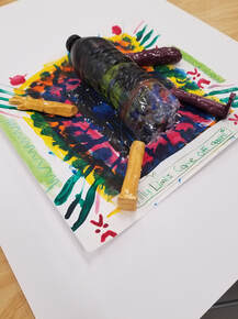
For the Multi-Media piece, I painted over a water bottle, sculpted limbs, and painted and colored the sheet of paper. I started by painting patterns and an angry face over a water bottle with acrylic paint. I apologize if the face is hard to see. I sculpted legs, an arm, and a claw for the bottle. I was originally going to insert the limbs into open holes on the bottle, but I hard trouble keeping it in a stable position, so i changed my plans for them. I carved a pattern on a block, painted over it, then printed the paint on the paper. I used watercolor to paint a pattern on the sheet. I used Prismacolor pencils to write what the bottle was saying, and draw some lines on the sheet here and there. I glazed the limbs, waited for them to be fired up, then put them in place to take the pictures.
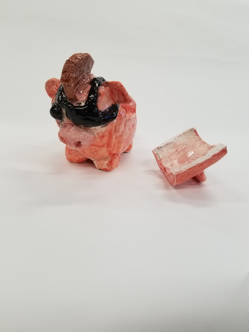
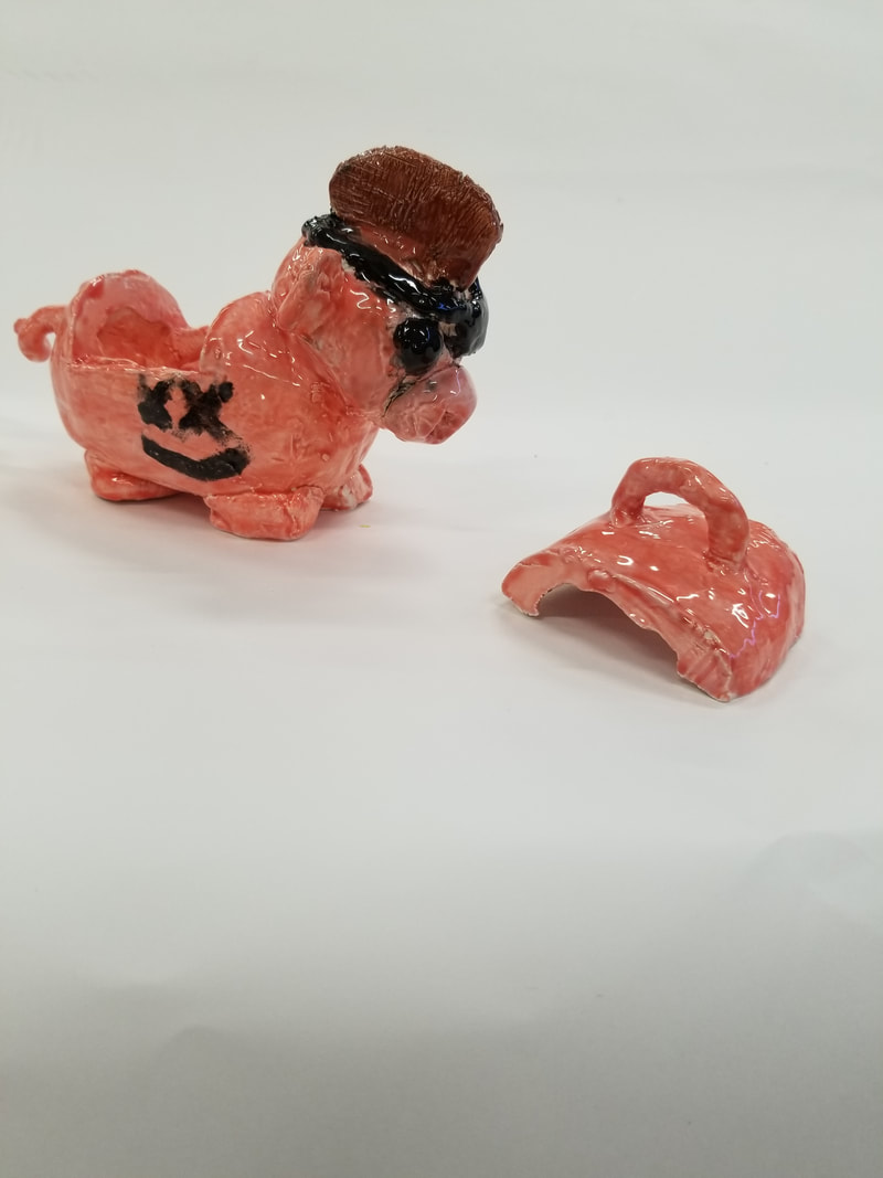
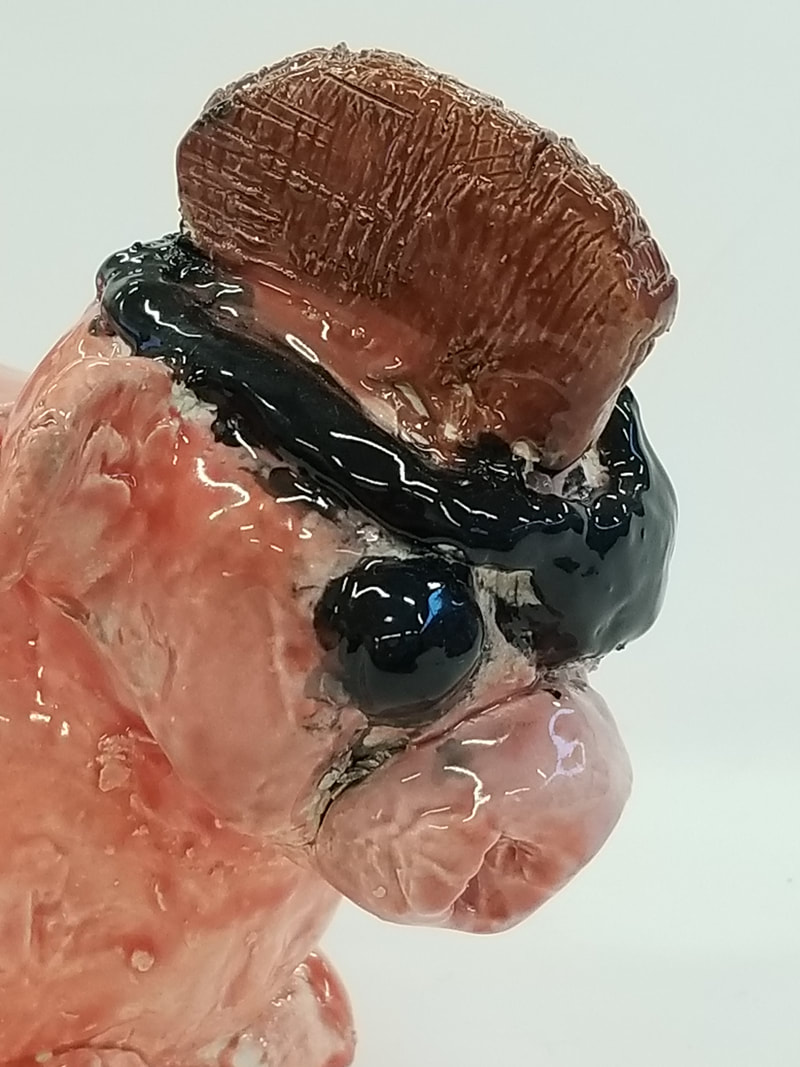
I was given the choice to either represent anger, or use trash for the assignment. I kind of did both, I emptied a plastic water bottle to use for the project, and represented anger by showing that the bottle is upset by the fact that his limbs are not attached to his body. After we received our sculptures after they were fired for the first time, we had to glaze them. We were instructed to paint two to three layers of glaze across all surfaces. We were also allowed to use acrylic paint, but I chose not to. After letting the glaze dry for some time, they were fired up again. After being fired up again after glazing, it is called "glazeware." I had success building the body of the pig, but had difficulty making and attaching the head. Next time, I'd go for a more simplistic or workable design.
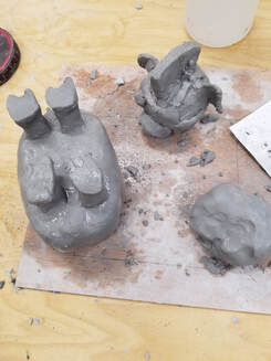 I intend to use the vessel merely for decorative purposes. I might use it to store something, but I think there other containers that do it better. The pig will be displayed at school for sometime before I can take it home. To finish it, it will be fired in the kiln, be painted over, and fired again.
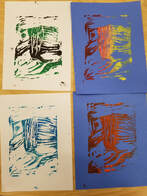
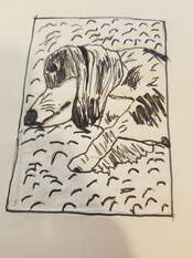
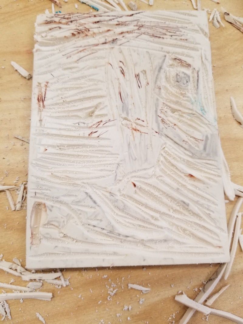
For our linocut assignment, I made a picture of my dog laying down whenever she wants to be petted. I incorporated the line theme we were assignment by carving my dog's fur, and the rug she was laying on, into lines.I believe that I did a good job drawing my dog and shading her properly. If I were to remake this, I'd carve it more carefully, as it is hard to see the dog. I'd also try to get more difficult details to draw in there as well.
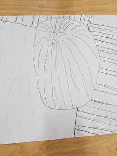
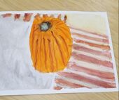
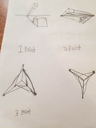
The pictures above are my painting for this unit, and the pictures below are warm-ups I found helpful. This is based on a picture I took of the pumpkin near the steps up to the front door of my house, which my family will use for Halloween. I used three point perspective for this piece. As I have stated before, my greatest struggle was getting the colors just right. I needed to change them up a bit, which made them somewhat different compared to the original photo. The warm-ups helped with drawing the piece by pencil first, and it helped me get used to painting more carefully.
|
AuthorWrite something about yourself. No need to be fancy, just an overview. Archives
January 2020
Categories |

 RSS Feed
