Brainstorming Ideas
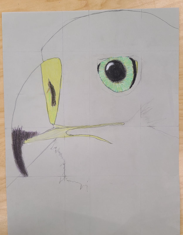
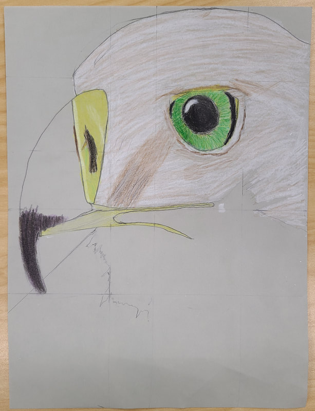
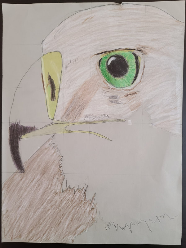
Sketches & References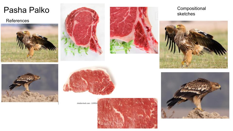 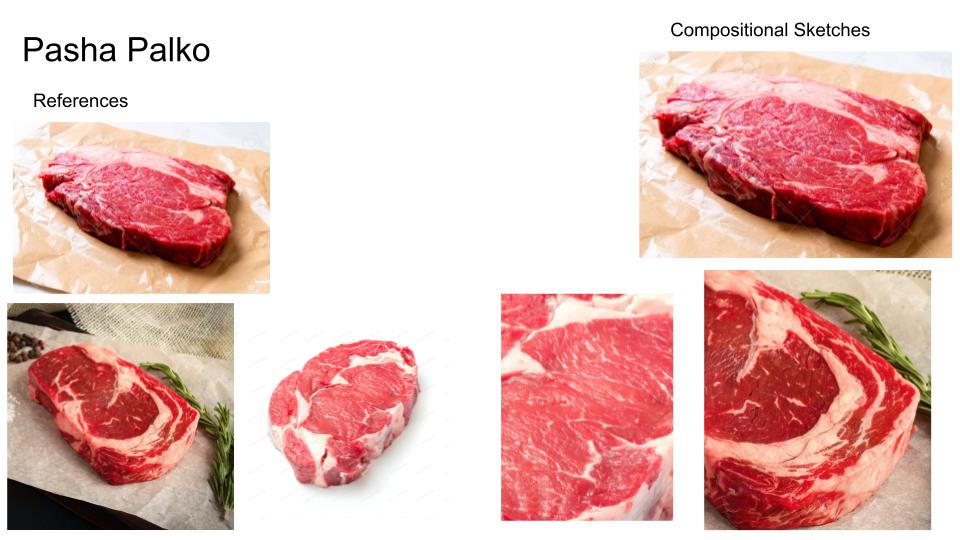 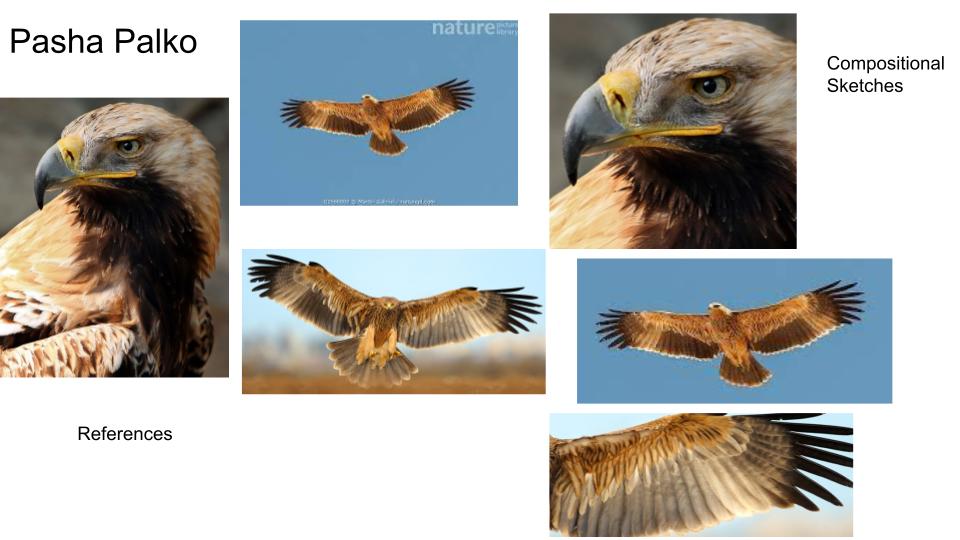 In-ProgressFinal Drawing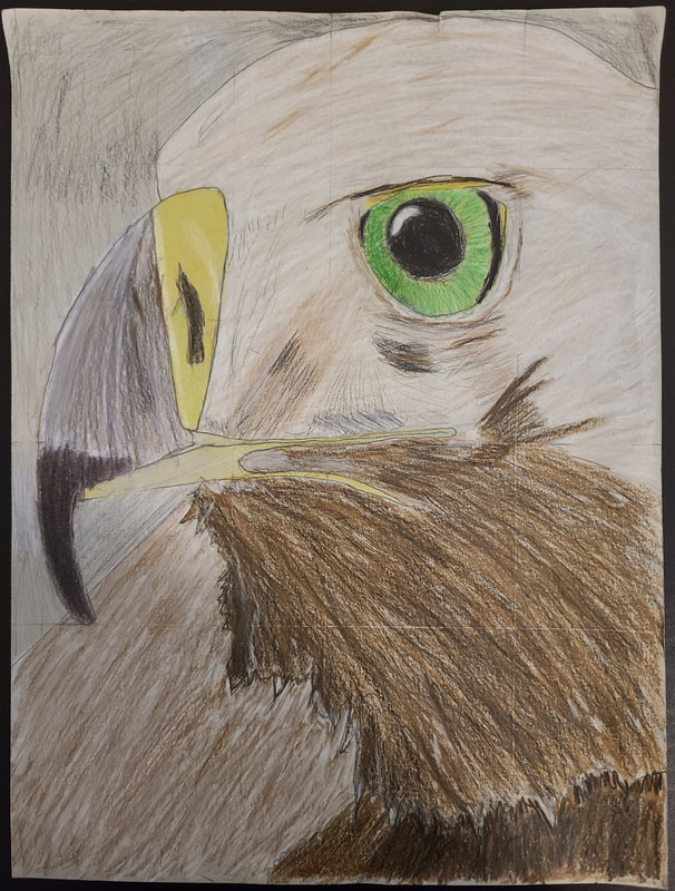 Reflection Questions1. I don't know if this necessarily counts as a technique, but I mostly tried to shade with the shapes so it didn't look flat. I also shaded in layers in certain spots to blend the colors.
2. I think layering has helped me darken and lighten different parts of the bird to make them more accurate to the reference photo. It helped to start with a base color, and then added layers of different colors until they blend and it shows value. 3. I think I succeeded in showing where the values are and blending them. I think I could've done a better job of showing a light source, as there is an abrupt change in lighting on the eagle's body. I also didn't really consider texture. I didn't exactly think about how color feathers, I simply tried to make the drawing accurate to the photo. 4. Using many colors helped to add value and to make the picture accurate. I used mostly brown, black and white. I also used dark green and light green for the eyes (and a bit of yellow), and used yellow for the mouth and nostrils. I was able to make the beak have a slightly different color than the other dark parts by using purple as a base color, then shading on top of it. 5. I used what we learned about Georgia O'Keeffe to brainstorm ideas relating to nature. Most of my ideas involve animals. 6. I think I did an okay job on this project. Although I used layering to get more precise values. I didn't succeed in making them transition smoothly or appear realistic. I think coloring the head was easier, as it was a lighter color and had some dark spots that I didn't have much trouble showing. I didn't do a good job of making the picture appear 3D. The eagle in the reference photo appears slightly angled, while my drawing looks flat. 7. If I were a critic, I would say it is decent, but could use improvement. The values are clearly shown, but do not transition well and doesn't have texture. I don't think my coloring shows that the bird has feathers. 8. I would improve this drawing by thinking of how an eagle's feathers look as I add value. This way it would appear more realistic and not rushed or flat. I still think graphite drawing pencils are my best tools, as I can use a Q-tip to blend values more easily. Graphite is also easier to erase, so I don't worry as much when I make a mistake. 9. Using colored pencils has both helped me and somewhat discouraged me. It has helped understand why it is important to think about angles and textures, but I still think this could've turned out better if I were allowed to use graphite to add value instead of Prismacolor.
0 Comments
Leave a Reply. |
AuthorWrite something about yourself. No need to be fancy, just an overview. Archives
June 2021
Categories |
 RSS Feed
