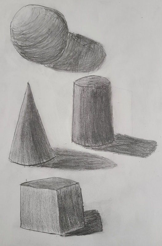
 We had another assignment to practice pen values. This time, we had to shade the shapes and shadows using stippling. I think I did decent, but my work is not as neat as the shapes that were already on the paper.
0 Comments
Sketches and Reference PhotosThese are pictures I took and the sketches I made, including the final, colored sketch. I had a little bit of trouble coming up with ideas for pictures, but I think they turned out well. I think the sketches did a good job of giving me an idea of what the final drawing could turn out like. In Progress PhotosThese are my in-progress photos of my project. I think they look good and I focused on easier places to shade first. I would later add smaller and finer details when almost all of the shading has been complete. Final Drawing This is my completed project drawing. I think it turned out pretty good, but it could also be improved. I think there could've been more value. I believe I've improved on making proper proportions. Critique Questions1. After taking my photos and drawing sketches, I chose the picture where I look into the blender at a slight angle. I drew another sketch of this picture, without values. I then had to draw another sketch, but this one has value. I got started on my final project drawing, and I decided to place lines on the drawing to help with proportions. I first place values on the blades and the structure that all the blades were on. I then added values on the bottom of the inside of the blender, and lastly added values to the cord and table. I went back to refine some of the lines of values, including the edges of the blades.
2. I think the composition is important as it provided an interesting perspective and allowed for a lot of values to be shown. I went with this angle to show a 3D effect, with the top of structure being closer to the camera, and the bottom of the blender being further away. This allowed for the top half of the structure to be visible, showing more detail. 3. I zoomed into various parts of the picture to find values. I had to consider the colors of the structure, blades, bottom, and the edges of the bottom. I also had to think about the metallic finish of the blades. 4. I achieved a good range of values, but I think I could've shown more. I used the F, 2B and 8B pencils. I used the F pencil to sketch the drawing, and used it alongside the 2B and 8B pencils to make darker values. I used a Q-tip to blend values to make them smoother. I find that using a Q-tip helps out a lot. I still think that certain values are not a smooth and could've shaded more carefully. 5. I think the picture is mostly neat. The proportions are certainly more accurate than previous drawings and projects I've done, and using Q-tips allowed me to blend values without smudging the picture with my fingers. As previously stated, the values could use some improvement. I think there are more intricate details that could've been shown, such as the reflections on the glass. 6. I believe that what we learned before this project was very important. We learned how to make proper values and how to make a visually pleasing composition. I think the camera angle as well as the different colors made the photograph look interesting and appealing. 7. I learned how to make more accurate proportions. Drawing straight lines to know where certain parts of the picture would go was time-consuming, but very helpful. Although I did not succeed in showing every single value and detail, I made sure to pay close attention to all the small details. 8. I think my primary obstacle was that fact that there were so many values and small details. This includes reflections and very small scratches. I overcame this by first focusing on the more pronounced details, such as the values on the blades, and finished the project by adding in most of the smaller, harder to notice details, such as the reflections on the glass.
This is my third in progress post for this drawing. I have added more values to it. It is going just fine so far, but there are still a lot of details that need to be added. I might struggle on the glass parts of the blender.
This is my second in progress photo. I started adding values to the blades and the tip of structure that has the blades. I think it is going pretty well. Using a Q-tip helps me blender the values.
 We have to post in progress photos of our projects. I decided to improve the proportions by drawing lines on the references photo, and then draw the same lines on the paper. I think it's working pretty well. I think this will make this project look better than my previous sketches.
For this assignment, we had to draw a final sketch before getting started on the project. I chose this picture because I think the camera angle makes for a good view of the blades inside the blender. This was not too difficult, but I struggled on getting the proportions to be super accurate. I also struggled on properly showing the shine marks of the glass.
These are my reference photos and sketches for this project. We had to take five photos of the what we will be drawing and make pick three to make sketches of. This was fairly easy for me, but I expect the final drawing to be much harder to make. I chose to take pictures of my blender, as I thought I could choose interesting perspectives for the photos. I really like the bottom picture because it kind of has a 3D effect and I think I can show a lot of value.
We have to come up with fifteen ideas for this project. These are my ideas:
These were fairly easy to come up with. However, I might have issues getting interesting photos of some of these ideas.
|
AuthorWrite something about yourself. No need to be fancy, just an overview. Archives
June 2021
Categories |


 RSS Feed
